
Monday, 9 May 2011

Wednesday, 16 February 2011
new draft for magazine cover
Today I changed my magazine title to make it more interesting and apply to my target audience which is females from the ages of 16-24. I also added a CD cover on the Magazine cover, to show that I have skills in creating CD covers also.


Also this is what my magazine would look like without the CD on the cover.

Monday, 14 February 2011

Wednesday, 9 February 2011


Today's research
Today I had found out how to plan my magazine contents page, and the order all the topics should be in.
Page order/ conventional
Page order/ conventional
- feedback/letters
- news articles
- new artists
- articles (features)
- posters
- live reviews
- album reviews
- gig listings.
Friday, 4 February 2011


Wednesday, 2 February 2011
Second draft of magazine cover
Through these re -drafts I can see what I need to improve on. for example this draft looks amateur with simple fonts. It also looks boring and would not attract the target audiance on a shop shelf. I need to re-think the colour scheme and layout of my images and text.


Wednesday, 26 January 2011
final draft of music contents page
The purpose of this post is to show the skills I have achieved in Adobe Illustrator. Also to identify how I could improve my contents page.


Monday, 17 January 2011
Planning of Setting and photoshoot
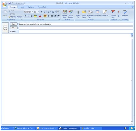
The purpose of this post is to show how i planned my photoshoot and gathering my participants. This is an easy and quick way to notify my participants on the location of the photoshoot and planning.



Friday, 14 January 2011
Editing My Images

Using Photoshop I developed skills that would improve my work and make it look professional. While creating my first draft for my magazine cover I used tools such as brightness/contrast in adjustments to brighten up my image to make it look more skilled.
I also used the quick selection tool which allowed me to highlight any part of my image and erase the parts I wanted to get rid of; this assisted me as I wanted to create an unreal effect. The tool I used to create a black and white effect for my background was by creating another layer and add layer mask then clicked the icon to change the picture either black or white. I also used the red eye tool which removed red eyes that the digital camera creates in some images; this makes the photograph look expert.
I also used sharpen edges in sharpen from filter. This made my images more focused rather than blurry. I also created a CD cover to place on my magazine to make it look more realistic. By doing this I clicked file, place, then I chose my image that I wanted to place.
Wednesday, 12 January 2011
Contact sheet


The purpose of this post is to show my images and add what I did right and what i could improve.
I could of done different shots to make the impact of the pictures more impressive and look professional. I also could of changed location to create a different variety. The larger images are the images I am going to use for my magazine as I think they are more suitable to use for my music magazine.
layout for my music magazine
The purpose of this post is to show what my magazine will look like including images, text, freebe and articles.


Monday, 10 January 2011
First draft of music magazine cover

The purpose of this post is to show how I will improve my skills in Adobe Photoshop and Adobe Illustrator, I will also show the kinds of tools I used to show I understand the programs.
Friday, 7 January 2011
Title Block Options For My Music Magazine
The purpose of this is to identify out of the five options my respondents think is better to use for my magazine title. Please do not vote anymore the polls votes have been counted thanks
1)


1)

2)

3)

4)

5)

Thursday, 6 January 2011
Mock up of school contents page
This is the mock up of my school contents page it will demonstrate how my real contents page will look.
I could improve this contents page by including more text and different images to make the page look more professional.

I could improve this contents page by including more text and different images to make the page look more professional.

Wednesday, 5 January 2011
Analysing Questionnaire Results
I will reveal my questions and what my 10 respondents wanted in my magazine through content, title name and colour scheme.
1.

I asked my respondents about my title name for my magazine and gave them 3 options to choose from that I felt represented the classical genre and out of 10, 1 chose The classics , 1 chose Ballad and the rest chose Soprano which will be my magazine title.
2.

I asked my respondents an open question for them to give me their own ideas on what to include in my magazine and out of 10 there was varied answers but most of them chose classical music.
3.

I asked my respondents a closed yes or no question to see if they would agree if the price for the magazine was reasonable, out of 10 the majority agreed it was; now I know that I am charging the right price for a monthly magazine.
4.

I again asked a closed yes or no question on what to put into my magazine and 7 out of 10 of my respondents agreed that it would make them more interesting, this helps me know what to include in my magazine to fill the gap in the market,
5.


I asked my respondents if an article was included might it interest them to buy the magazine but just by over half of my respondents which is roughly 6 out of ten said no, which means I will not include the article in my magazine.
6.

I gave my respondents a closed question instead of ticking boxes they were able to contribute their own ideas, 5 out of 10 agreed white/black, 2 out of 10 agreed other, 1 agreed pink/black and 2 agreed white/blue, which helps me decide on my colour scheme which will be white and black.
7.
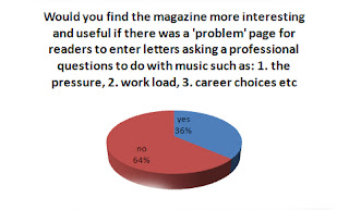

I gave my respondents a closed yes or no question which asks if they would like a specific page in the magazine like a helpline, but 7 people said no whilst 3 said yes. This assists me to know what will attract readers and what will not.
8.

To gain more readers to fill the gap in the market, I asked my respondents if they would like updates on the feature artists that are presented in the magazine and 7 said yes while 3 said no, this helps me to understand what will lure the readers.
9.


To gain a younger variety of audience I decided that adding modern young music to the classical style magazine this would attract them, and 8 out of 10 of my respondents agreed with this proposal.
10.

The final question was aimed at what readers can add to the magazine so we would gain more wider range of audiances.
Monday, 13 December 2010
Analysing block titles
I will demonstrate how the title of a magazine can interpret what genre the magazine will be and its target audiance.

Colour
Font style
Colour
Font style

Colour
Connotation
The bold letters have a bold outline which signifies the magazines contents will be loud, daring and interesting, which will appeal to its target audience which could be an indie/ rock audience as these colours represent being loud and interesting music.
Colour

Connotation
the magazines title has a black shadow, which would signify its importance and that the magazine will be exciting and interesting for its readers, this magazine could be a kind of rock and roll magazine or old style magazine.
Colour

ConnotationThe Title of the Magazine’s design is very grunge as it looks smashed, this represents how rock legends smash there guitars at concerts, which tells the audience that the magazine will be based on the genre of indie/rock.
Colour
Connotation
the title of the magazine is very light and looks different from other magazines which could make the genre a dance style magazine.
Colour
Denotation
Big bold red letters which stands out and is a short title which keeps the audience interested and the 3 main colours red, black and white.
Connotationthe word vibe is a music genre word which indicates that the magazine is a music magazine, whilst the word vibe is a slang word for vibration which is an explanation of the strings on a guitar, revealing the genre to be indie/ rock.
Connotationthe word vibe is a music genre word which indicates that the magazine is a music magazine, whilst the word vibe is a slang word for vibration which is an explanation of the strings on a guitar, revealing the genre to be indie/ rock.
Colour
The 3 contrasting colours could symbolise that the magazine has a variety of readers and caters to a wider audience, and the red could symbolise passion for music.
Font style
The font is similar to bold Ariel doesn’t use serifs which shows a dedication to music but the size of the font represents the loudness of the magazine and the great music which would entertain the audience,
Suggested image
Suggested image
Of all the attributes of the title block I would assume that the magazine is a indie/ rock genre and would cater to audiences such as teenagers and young adults.

Denotation
The big bold letters assist the luminous colour which helps it stand out and catch the audience’s attention. The name of the magazine ‘the source’ helps the magazine gain gravitas as we associate the word ‘the’ in front of words or names of people we believe to be important so the word ‘the’ makes the magazine seem more important.
Connotationthe colours of the magazine are different which could symbolise that there are many aspects of the magazine which could cater to more then one type of audience, and the phrase ‘the source’ could symbolise that the magazine is where you get all the information from about this kind of music.
Connotationthe colours of the magazine are different which could symbolise that there are many aspects of the magazine which could cater to more then one type of audience, and the phrase ‘the source’ could symbolise that the magazine is where you get all the information from about this kind of music.
Colour
The two contrasting colours luminous yellow and black could symbolise a kind of grunge magazine as the colours do not match like it is out of the ordinary.
Font style
The font is similar to bold Ariel doesn’t use serifs which shows a dedication to music but the size of the font represents the loudness of the magazine and the great music which would entertain the audience, but the sideways of the word ‘the’ gives an interesting twist to the magazine.
Suggested image
Suggested image
All the attributes of the title including the grunge style colours and the font style help identify that the magazine is a grunge, rock genre style magazine and that the target audience would be young adults to middle aged men.

Denotation
The letter ‘Q’ is short for an acronym, it is short for the name of the man who raised the magazine which can also associate a mysterious ideal magazine which is ‘Quieten Richardson’.
Connotationthe bold letter and bright background symbolises the sophistication of the magazine which helps the magazine gain more readers as it appeals to people as they believe if they buy a sophisticated magazine then they will be sophisticated also.
Connotationthe bold letter and bright background symbolises the sophistication of the magazine which helps the magazine gain more readers as it appeals to people as they believe if they buy a sophisticated magazine then they will be sophisticated also.
Colour
The colours red and white could symbolise England, which shows it’s an English magazine and has English angles to music.
Font style
This kind of letter has a serif which shows a classy aspect of the magazine. And that it is the first letter of a mans name.
Suggested image
Suggested image
A classy magazine is imagined as the block title is an interesting example of sophisticated magazines and how they will have music but not any explicit music which helps understand who the target audience is, which is children from all ages men and women.

Denotation
The meaning of the title is ‘new musical express’, most magazines shorten their title which is called abbreviation, this is to make the title short and to the point which would attract the reader, to catch their attention.
Connotation
The bold letters have a bold outline which signifies the magazines contents will be loud, daring and interesting, which will appeal to its target audience which could be an indie/ rock audience as these colours represent being loud and interesting music.
Colour
The 3 colours of red, white and black are interesting as normally a background would be white and the outline would be black but here it is the other way round, which gives a significant idea that the magazine will explore all kinds of different music.
Font style
The font style looks like Ariel Black which is excellent for a magazine that was to stand out to readers on a shop shelf, and this title has grasped it as its bold font gives the reader the impression that the magazine will be exciting and different.
Suggested image
Suggested image
An epic and diverse magazine is interpreted as it will be unlike all the other magazines in the market as the font style along with the colours create an impact that catches the readers eye.
Denotation
The word mojo originally means a charm or a spell. But now it’s more commonly said meaning sex appeal or talent.
Connotation
the magazines title has a black shadow, which would signify its importance and that the magazine will be exciting and interesting for its readers, this magazine could be a kind of rock and roll magazine or old style magazine.
Colour
The colour scheme of black and white with a black shadow could show that the magazine has a old style that will attract readers as it is a genre that has a gap in the market at the moment.
Font style
This font looks like Berlin Sans FB which has no serif but has a more sophistication to it. Which attracts readers as you can tell by the title what kind of genre it is, as you wouldn’t have a rock magazine with serif writing.
Suggested image
Suggested image
This magazine is interesting as it seems to be a rock and roll magazine also the genre of rock and roll has faded throughout the generations, so the gap in the market may impress readers with this magazine.
Denotation
Kerrang is onomatopoetic; it refers to the sound made when playing a power chord on an electric guitar, for anyone who knows about music they would know that electric guitars are used in genres such as indie and rock, and automatically tells the reader that the magazine is an indie, rock magazine.
ConnotationThe Title of the Magazine’s design is very grunge as it looks smashed, this represents how rock legends smash there guitars at concerts, which tells the audience that the magazine will be based on the genre of indie/rock.
Colour
The use of the colour black shows the stereotype of indie band members or singers constantly wearing black, this could be related to the features in there magazine to keep the colour in the magazine the same,
Font style
This font looks similar to Algerian which is not sophisticated or fancy but is a kind of different style to any other magazines, which will attract the reader, the diverseness of the titles font shows that it is a loud kind of style of music.
Suggested image
Suggested image
This magazine will be loud and have a colour trend of black as it is an indie style magazine with interesting features which will stand out amongst other magazines.


The breakdown of the title ‘mix’ shows that the magazine has a variety of content in the genre and the ‘mag’ is obvious as together it means that the magazine will have varieties of different style of music.
Connotation
the title of the magazine is very light and looks different from other magazines which could make the genre a dance style magazine.
Colour
The colour and shade of orange is different from other magazines as the colour orange is normally used in rock magazines but in a darker shade to show individuality, but here it is to show how fun the magazine will be.
Font style
This font looks similar to Eras Bold ITC it is big and has no serif, but has a bright colour which reveals how the magazine is lively.
Suggested image
Suggested image
The magazine will be a dance magazine that has a lot of colour and will be interesting to the reader as there is a gap in a dance music magazine.
Sunday, 12 December 2010
Proposal for my magazine
The main point of this proposal is to find out who my audiance will be for my magazine and aspects such as :
age
gendre
ethnicity
location
age
gendre
ethnicity
location
The chosen genre I have decided is the best choice that has a gap in the market is classical, classical music is commonly known as boring by younger readers so I intend to make it more up to date but still keeping the original classics, I will mix the classical genre with a younger generation genre which is Indie. I will also include other aspects that will attract a wider range of readers this will boost the gap in the magazine market. My chosen audience is C1 to D socio economic scale teenagers aged 16-21 and will be in the UK, who will be mostly be white working class as it is common that white ethnic people tend to listen to more classical music, because I believe that even though they are not the target audience of most classical music magazines they are the one of the largest groups of readers, and I believe that they can change the gap in the market. Although my target audience is for both male and female, I believe that the male ‘masculinity’ issues of needing to be tough etc will decline as many male readers.
Subscribe to:
Posts (Atom)